Data-Vizualization
Vizualization collection
I’m learning how to created informative dashboards in Excel and Power BI. Here I will show my most recent or best vizualizations in excel, power BI and Tableau.
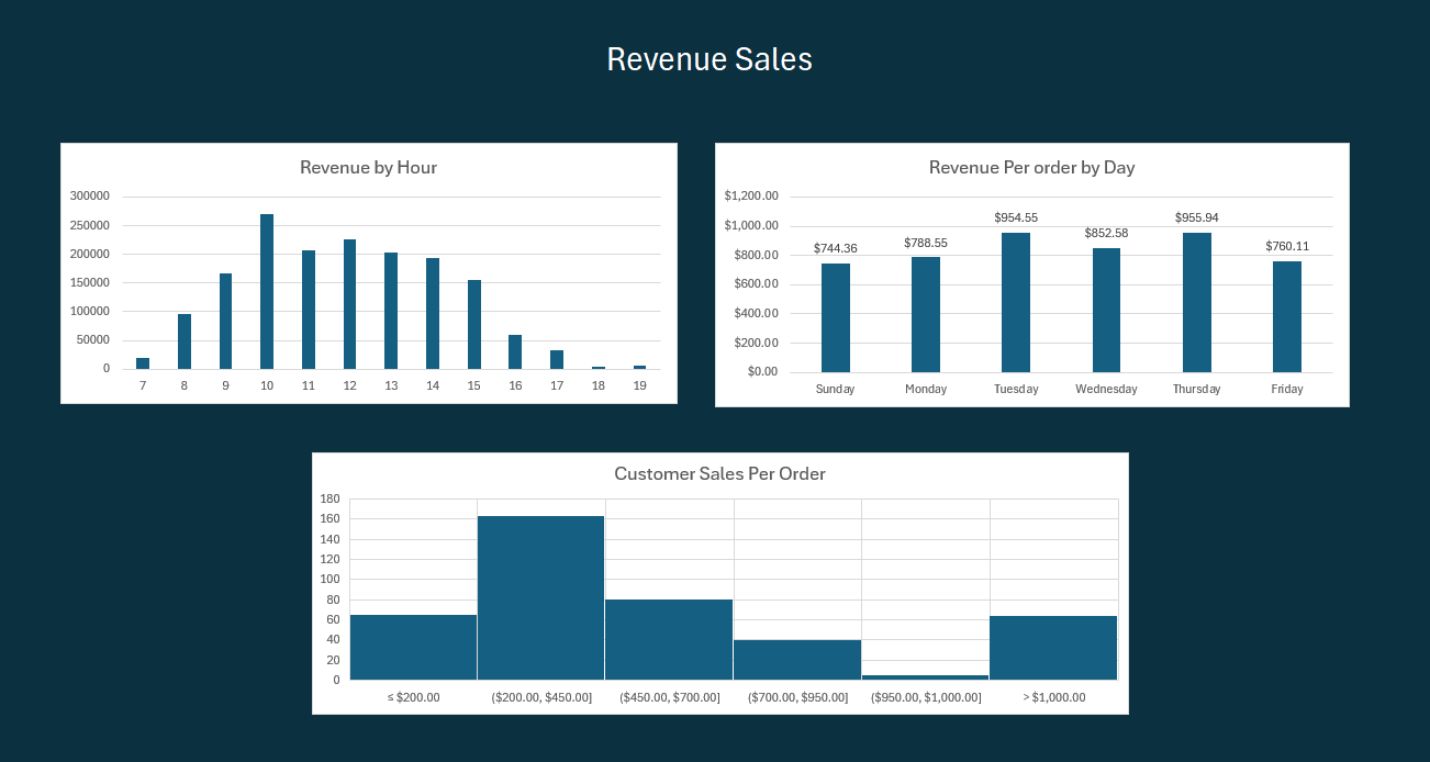
Excel Kaggle OnlineRetail.csv
- Revenue Sales Dashboards My first excel dashboard based on Kaggle OnlineRetail.csv. Here I found that Most sales occur on Tuesday and Thursday with a slight drop on Wednesdays. I also did a histogram to reveal that most orders were in the $200-$450 range with a small spike in large orders over $1000. My actionable recommendation would be sending out a special 10% off up to $45 to target customers in this range.


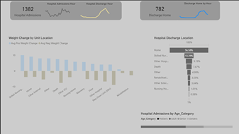
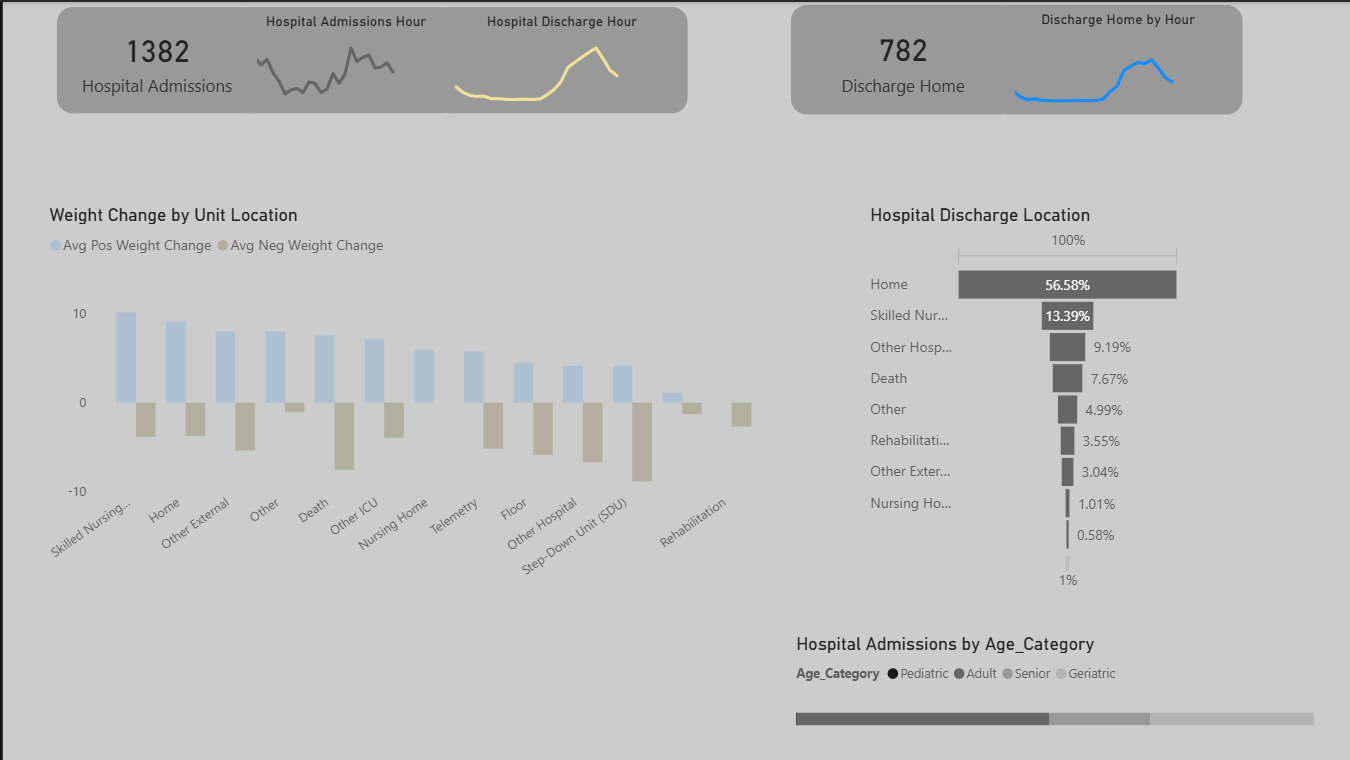
Power BI Kaggle EHR
- EHR Addmisions Dashboard Power BI dashboard based on https://www.kaggle.com/datasets/anuchhetry/electronic-health-record. I was interested in the discharge timestamps between discharging to home or other departments. I also found the positive and negative weight loss by unit enlightening.

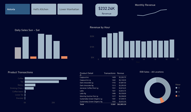
Power BI Coffee Shop Sales- Maven Analytics
- Coffee Shop Dashboard Power BI dashboard based on Maven Analytics Coffee Shop data. I highlighted the sales after 8 pm as being far below the sales previously for two of the three locations. Since the majority of later sales are from Hell’s Kitchen, I would recommend keeping that location open past 8 pm. For Astoria and Lower Manhatten, however, I would question whether the revenue generated is worth the cost of staying open. Since there are no sales at all for Astoria, I would assume they are already closed after 8 pm.
